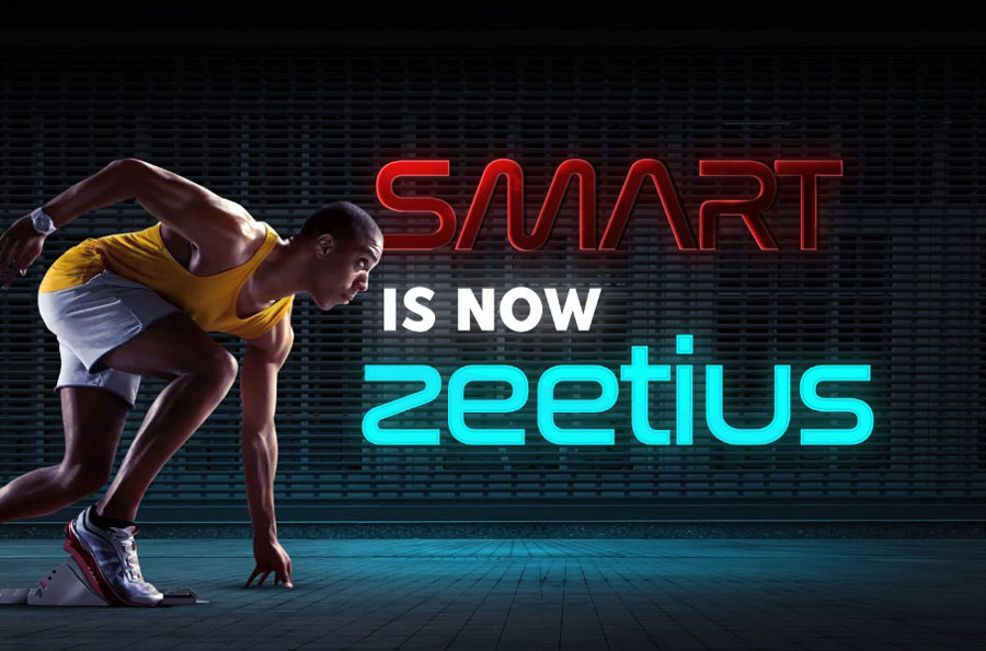
We are thrilled to announce the rebranding of our product as Zeetius to our customers. Our new brand name signifies our focus on providing intelligent sports automation that caters to a diverse range of sports. We aim to revolutionize the way people engage with sports.
Why we rebranded SMART : The story behind it
APR
23
We believe that, as businesses grow, their visual identity should grow and improve too. Rebranding is a bold and exciting new step in an organisation’s life. As we grow and evolve as a team and as an organisation we realise that this is the right time for a new brand identity. As our core values remained the same, we started our journey to embrace a new visual identity for SMART.


Why did we do it?
Here are the reasons for rebranding our product SMART
1. We have outgrown the SMART (Sports Management automation for racket sports) brand and what it represented.
We've outgrown the name ‘SMART’ to a point where it no longer fits who we are. And while we've emphasised bringing digital transformation into the sports arena, we're excited for the next chapter to begin.
2. We want to modernize our brand identity and keep it evolving with the times.
From smart TVs to smart watches to smart Technologies, it was everywhere. We wanted a new unique brand identity that aligns with iCore's vision to provide innovative and cutting-edge solutions to the sports industry while unifying people, technology and sports.
3. Expanding into new markets and differentiating ourselves from competitors
With millions of businesses trying to make a name for themselves, having a strong brand identity has become crucial for businesses to differentiate themselves from their competitors.
4. Our website needed an overhaul. Our website hasn’t undergone much of a makeover since we launched it. So we are also planning to revamp our website along with rebranding with a trendy and refreshed style.
How we did do Rebranding?
Rebranding is not just about a new logo. It’s about more clearly defining your brand strategy and then building an entire brand identity that reflects that.
So, we started by building the strategy first. Once we had revised our strategic direction, and updated our mission, vision, and values, we partnered with our friends at Adridge Media to build our new brand identity. They took our strategy and creative direction to create a new brand identity along with an energetic colour palette reflecting Trust and confidence.
Introducing our New Brand Identity
The new brand identity ZEETIUS-The Language of Sports aligns with iCore's vision to provide innovative and cutting-edge solutions to the Sports Industry while unifying people, technology and sports. Zeetius encompasses iCore’s commitment to enabling a seamless and hassle-free experience for sports enthusiasts.
Zeetius is inspired by the Olympic motto Citius meaning Faster. The rebranding aligns with iCore’s motto of unifying all Sports with a single automation solution. It signifies how the Sports Industry can be empowered using cutting-edge technologies.
The new colour palette, a combination of blue, yellow, and black creates a zesty and visually striking colour palette that is both trustworthy and energetic, while also conveying a sense of sophistication and power.
Now we finally have a brand that truly reflects what our product offers to the sports arena and we’re excited to show it off to the world! We hope you love our new look as much as we do! iCore is confident that this move will reinforce its commitment to innovation and excellence in the sports industry and is set to become a rising power in the Sports Automation Software Industry.